.svg)
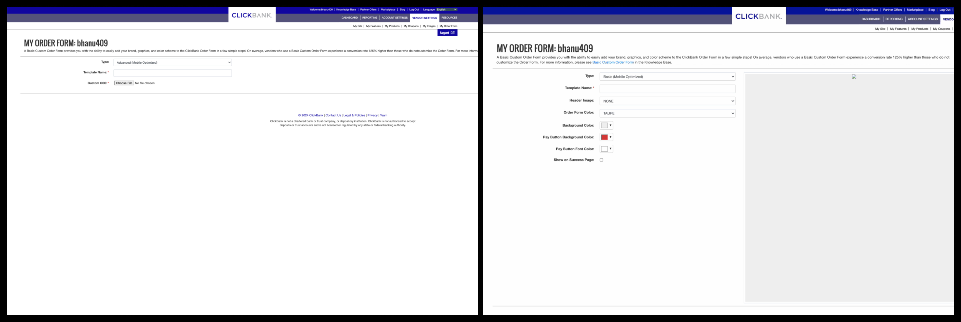
ClickBank’s legacy order form editor was functional but outdated, unintuitive, and heavily reliant on CSS for customization — creating friction for sellers and limiting revenue potential. I championed the research, design, and launch of a modern WYSIWYG editor built on ClickBank’s new design system. The result was a friction-reducing experience that empowered sellers to build tailored order forms without coding, increased user engagement, and delivered a measurable 15% boost in conversions.
The existing order form editor posed three major roadblocks:
Users described the experience as dated and inconsistent with modern editing tools.
Without real-time preview and intuitive feedback, users struggled to understand how edits affected outcomes.
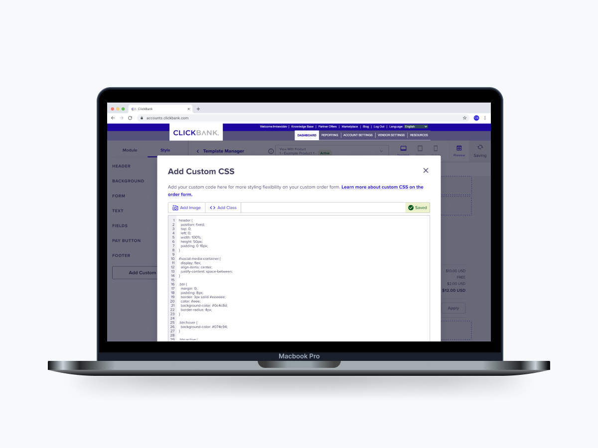
Advanced customization required CSS, excluding non-technical users and slowing sellers down.
These issues directly impacted sellers’ ability to create optimized order experiences — ultimately limiting conversion and revenue growth.
I led this initiative as the sole Product and UX Designer, owning the end-to-end experience. From research and synthesis to ideation, design, testing, and launch readiness. I collaborated closely with product leadership, engineers, and sellers to ensure the editor delivered real business value and supported scalable workflows.
To understand seller needs and competitive expectations, I did the following:
I conducted interviews with both internal teams and active sellers to evaluate the existing order form builder and understand real-world workflows. These sessions focused on identifying usability friction, validating mental models, and uncovering what sellers needed from a modern builder to feel confident creating and optimizing their order forms.
I conducted a comprehensive review of leading WYSIWYG and e-commerce builders to identify patterns, workflows, and interaction models that resonated with users. Leveraging AI to accelerate synthesis, I took the key best practices and innovative solutions, highlighting opportunities to differentiate ClickBank’s editor while ensuring sellers would find the experience familiar, intuitive, and efficient.
I performed a detailed heuristic evaluation of the existing order form builder, systematically identifying friction points, inconsistencies, and usability gaps. This process surfaced critical barriers that were slowing seller workflows, from confusing interactions to hidden functionality, providing a clear roadmap for redesign priorities and design decisions that would maximize impact.
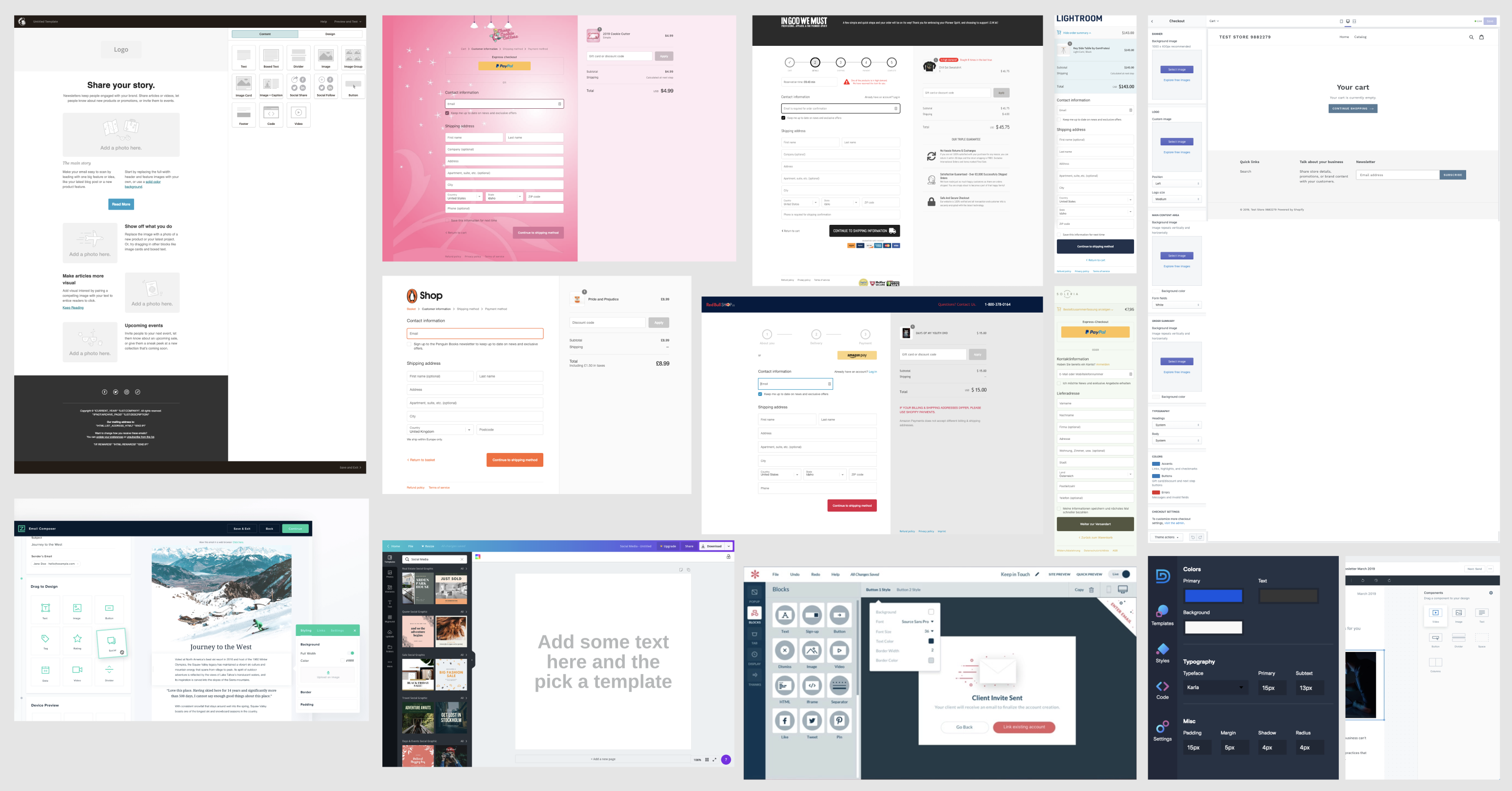

AI was a great tool to use. It helped us find the key insights from competitive examples and surface common usability patterns. All while core decisions remained grounded in direct user feedback and product context.
Key insight: Sellers didn’t want more power, they wanted confidence. Autonomy, clarity, and real-time feedback mattered more than raw flexibility, and eliminating code dependency was critical to unlocking growth.
Grounded in research, I defined design principles that guided the solution:
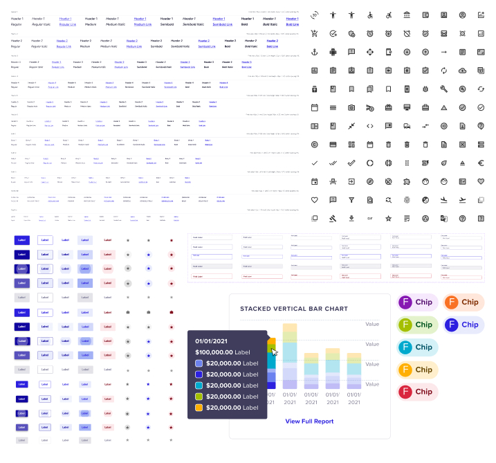
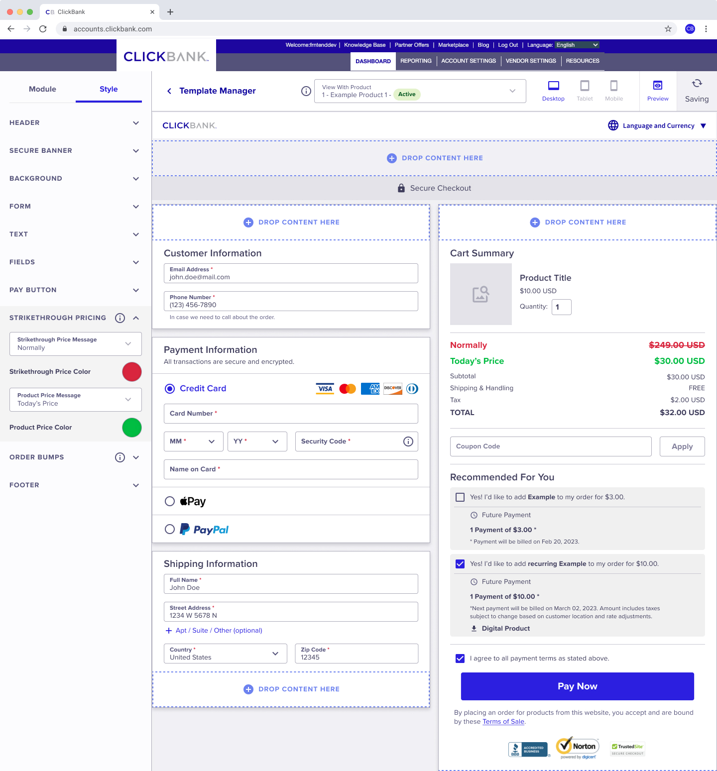
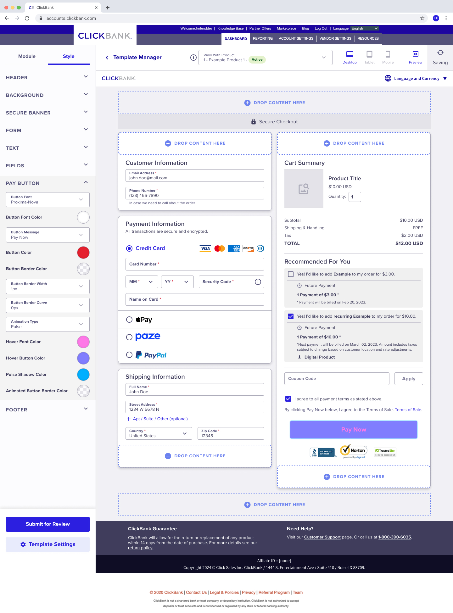
I aligned UI patterns with familiar editing tools to reduce the learning curve, designing the editor to feel immediately familiar. By integrating the updated design system, I improved consistency across the platform and enabled sellers to focus on building and optimizing order forms.
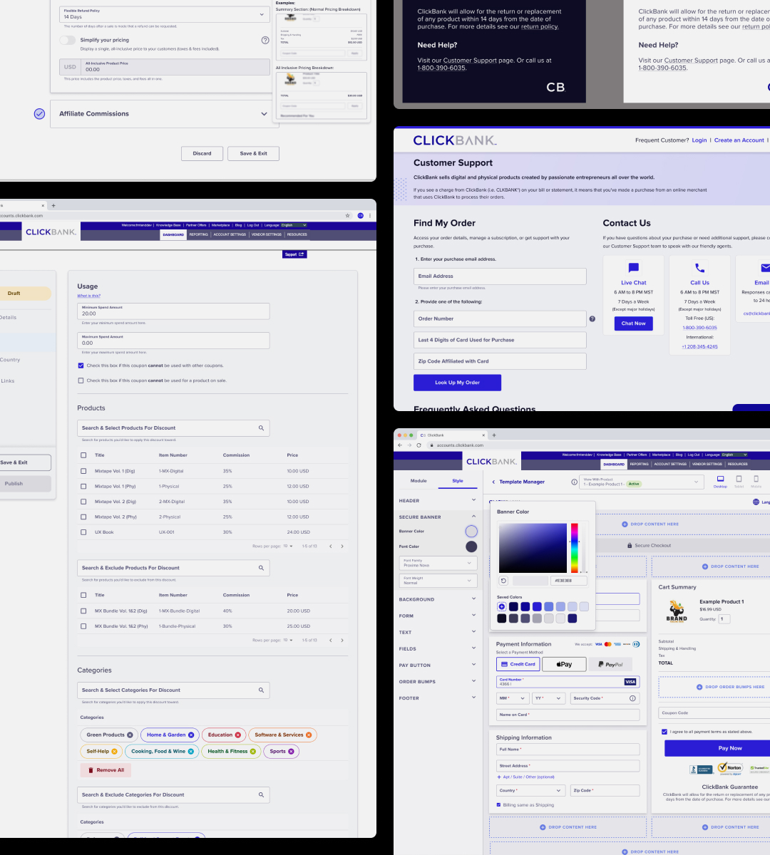
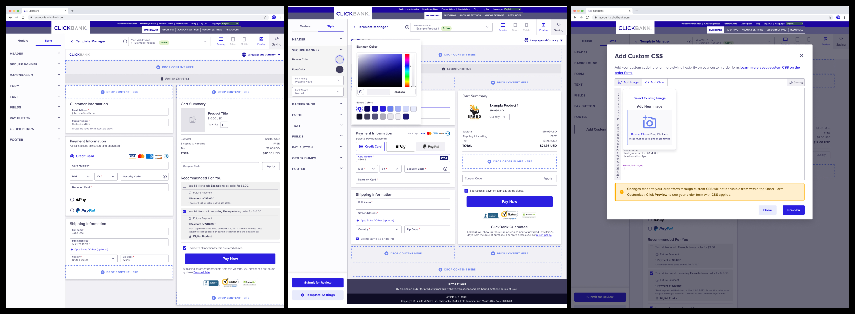
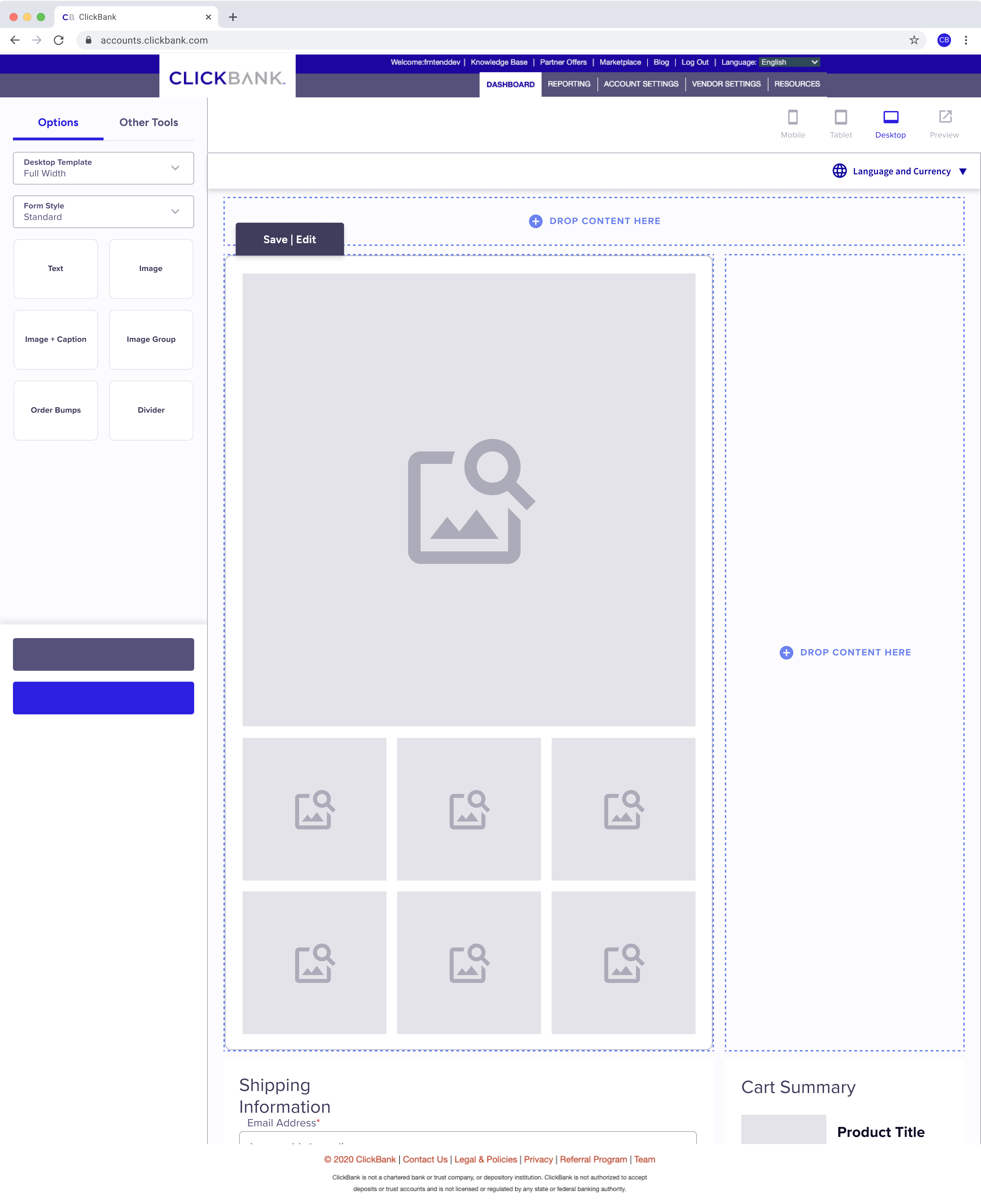
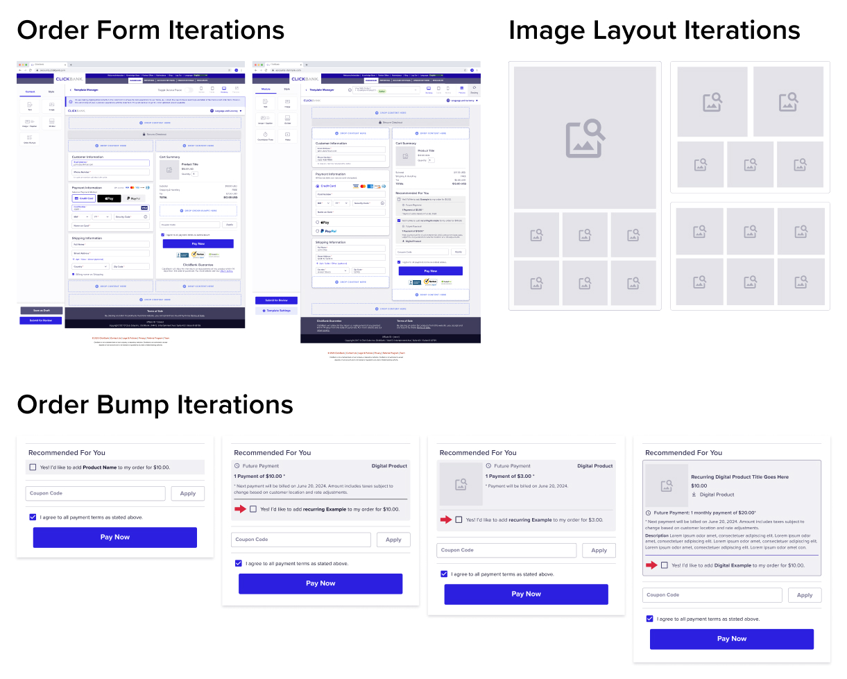
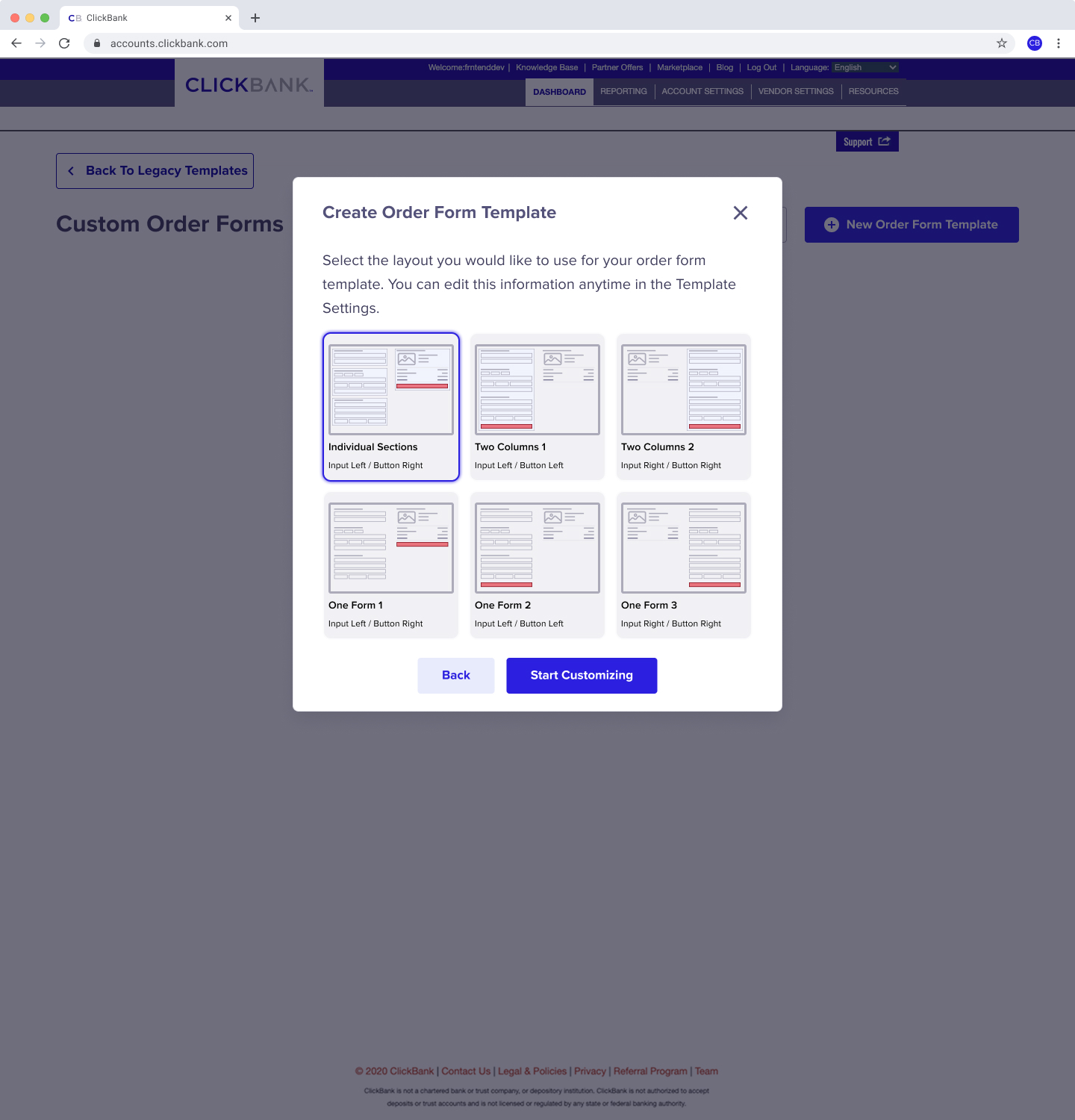
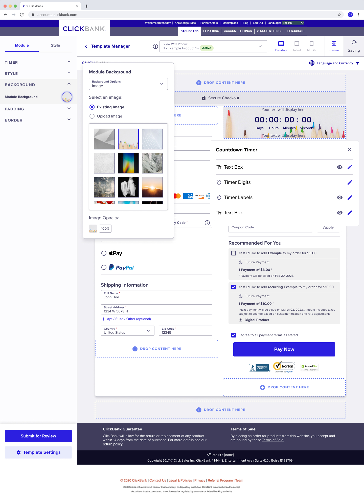
I introduced real-time previews to deliver immediate feedback, improve feature accessibility, and guide users toward the right content. Sellers could also start from high-performing templates, reducing friction and eliminating the need to build from a generic order form.
I introduced drag-and-drop interactions throughout the editor, enabling everyday users to customize order forms without code while still supporting advanced CSS for power users.
I created multiple low-fidelity concepts, iterating quickly and aligning with engineering feasibility and business goals.
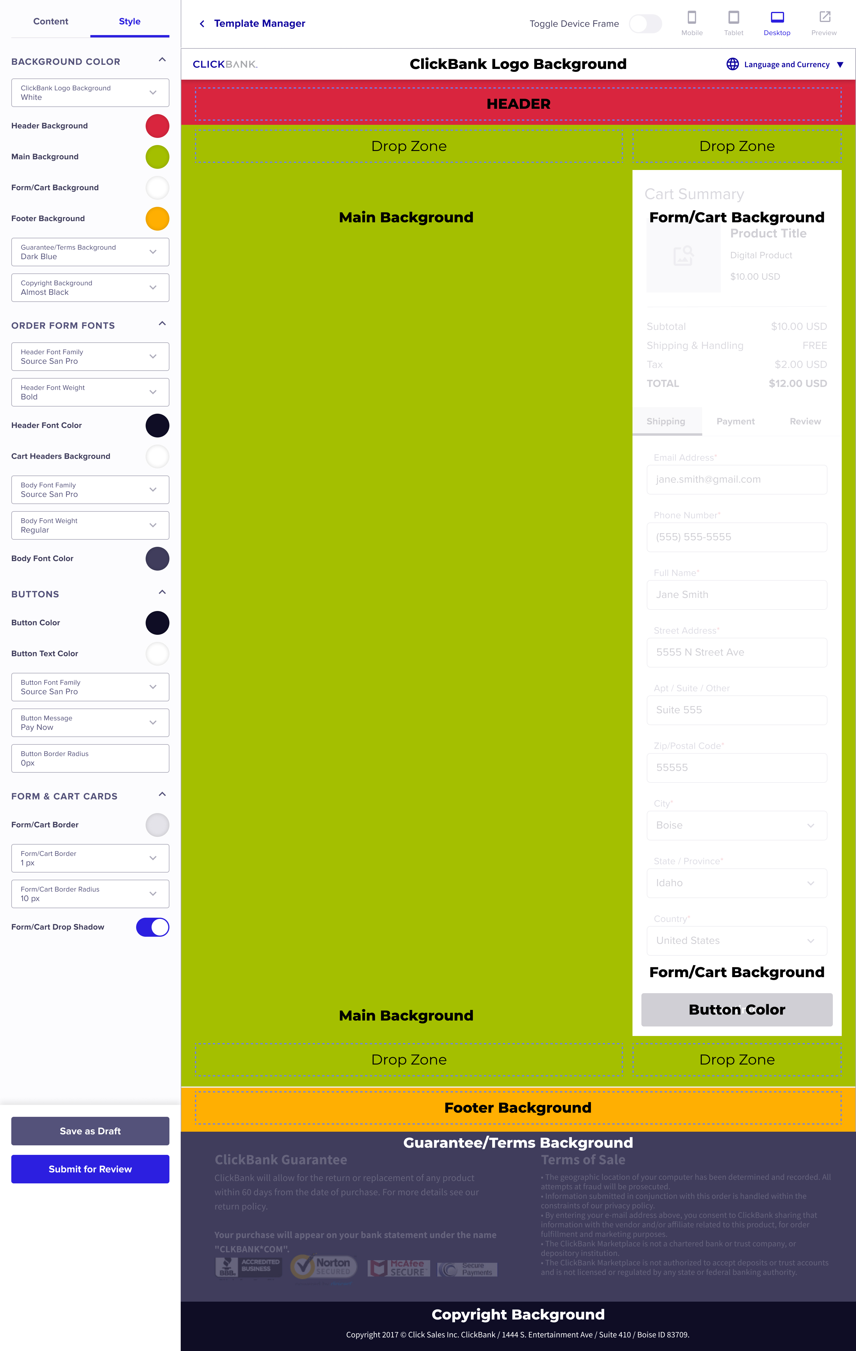
Using our updated design system as a foundation, I developed UI mockups and prototypes that:
Worked responsively across desktop, tablet, and mobile.
Simplified the customization hierarchy.
Reduced unnecessary interactions.
Prototypes underwent multiple rounds of internal testing and feedback, driving refinements and prioritizing clarity and ease of use.
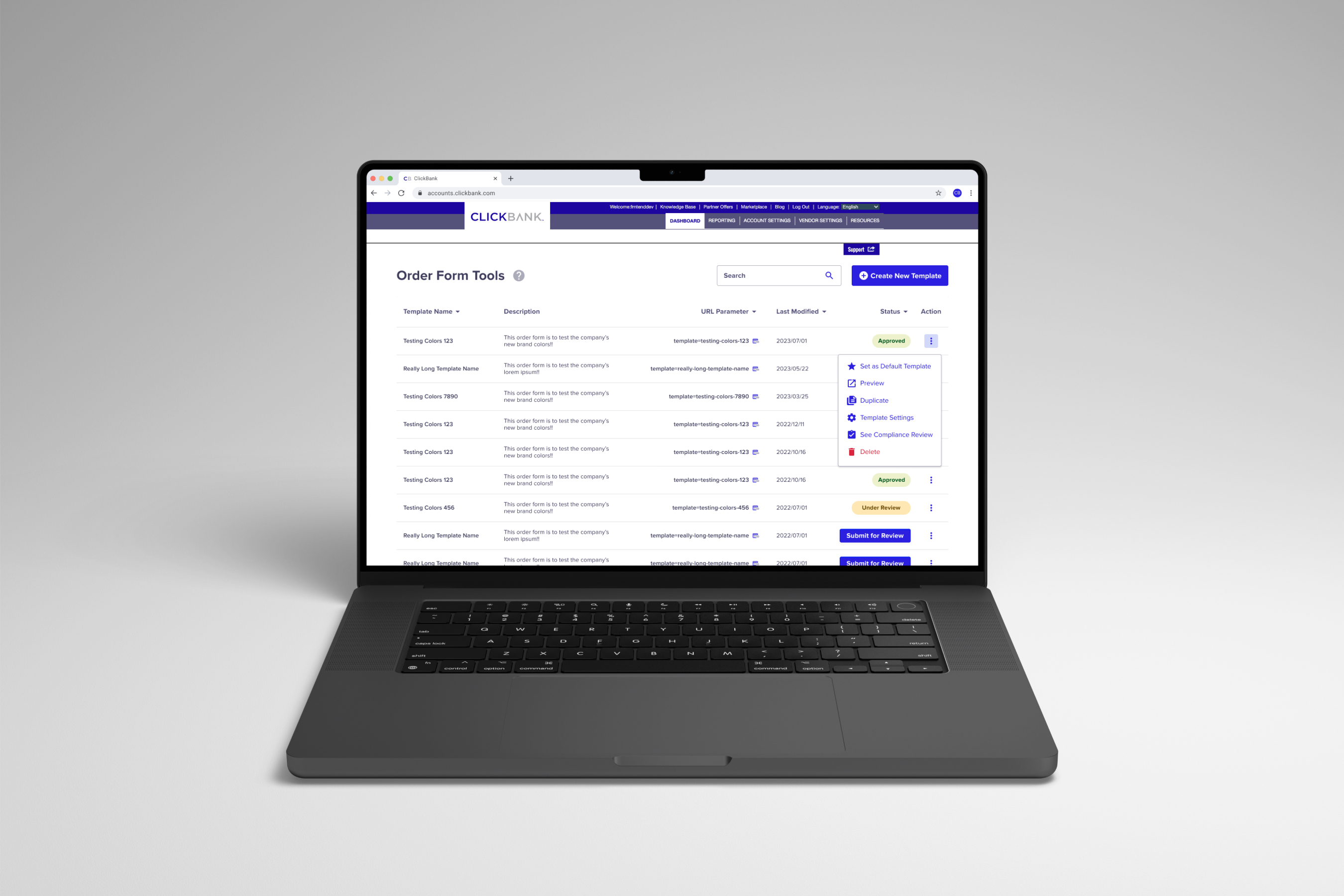
The final WYSIWYG editor entered beta testing and, following positive feedback, launched to all ClickBank users, enabling them to:
Visually assemble and preview order form elements.
Drag, drop, and configure content blocks without code.
Access optional advanced CSS for fine-grained control.
Deploy order forms with confidence and speed.
The experience transformed a once-complex tool into a seller-led, no-code platform, greatly enhancing autonomy and adoption.
After a year of dedicated design and iteration, the WYSIWYG order form editor launched to all ClickBank users, earning strong positive feedback and delivering measurable results. Its success spurred new feature requests and established the editor as a scalable high-value platform. It's now a cornerstone for future enhancements and the standard for no-code tooling across the platform.
Sellers using the new editor saw a notable uplift in conversions — a clear business win.
Users no longer needed CSS expertise, reducing reliance on developers and accelerating iteration cycles.
~85% of users reported improved ease of use and a more enjoyable experience navigating and building order forms.
Designing for autonomy unlocks business value: By reducing technical barriers, users were able to experiment and optimize in ways that directly contributed to revenue.
Leverage systems early: Building on our design system accelerated consistency and reduced design debt.
Iterate with purpose: Continuous feedback loops ensured our decisions were grounded in user need, not assumption.